


quarter is a cosmetic brand that contains minimal artificial ingredients to gives the experience a static and comfortable daily life. quarter not only helps to reduce your skin-care concerns by a quarter by using natural ingredients but also presents a harmonious emotion to suit your lifestyle. quarter brings you an emotional and natural skincare solution that helps reveal your most natural and beautiful authentic self.

Naming
The brand name "Quarter" means "1/4" in a unit meaning that it reduces the anxiety of skin care by a quarter and decreases the artificial chemicals in existing cosmetics to a quarter as much as possible. Defining quarter as a brand specializing in a natural functional skincare solution to present emotional and optimal experience in an individual's lifestyle, we have developed our unique brand concept-to present new possibilities of the cosmetic function.


Brand principles
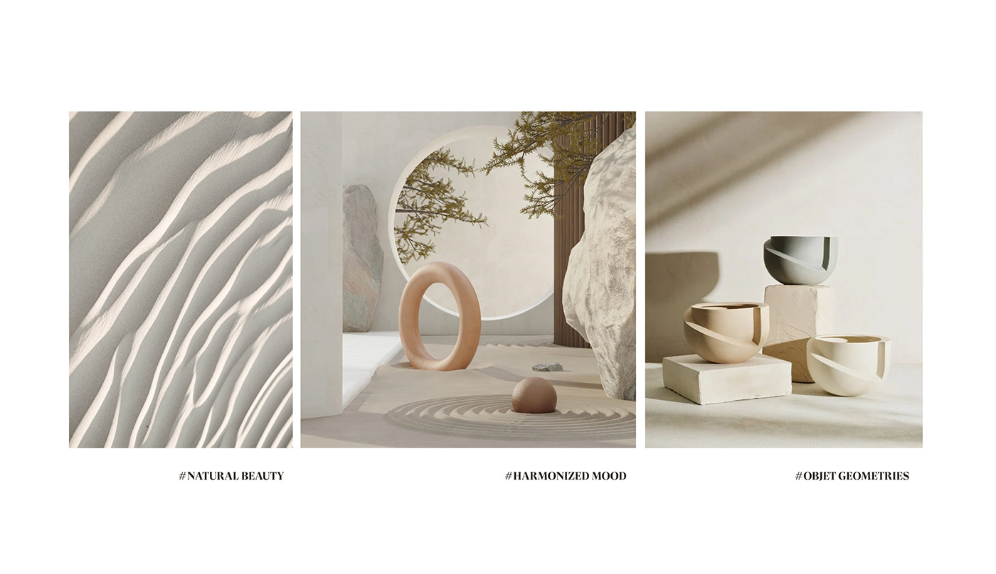
One of the design keywords of the quarter is a geometric form of overlap. We found visualization of the word "quarter" in this form of overlap, and through it, The logo and brand typo of the quarter intuitively show the identity of the brand.


The branding principle of quarter is intuitively consistent
with logos and typos, as well as product containers themselves.
with logos and typos, as well as product containers themselves.

Brand Core Value
The brand core values conveyed by Quarter are those that are built on our belief to present better life values to our customers.


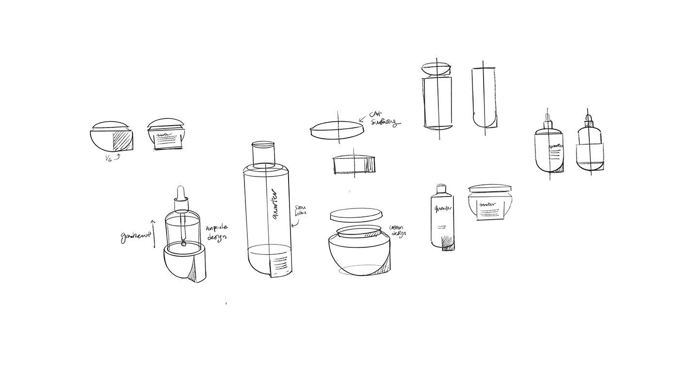


During the Covid 19, consumers spend more time at home, and the need for willing to decorate their home interior has increased. However, when we look around the dressing table, many container brands are not harmonious with the home interior.
quarter is a brand that meets aesthetic function as an interior prop and it started from a new approach with the branding principle that reduces harmful substances from existing cosmetics to the maximum by using only eco-friendly materials. Also,we hoped to convey an intuitive and consistent atmosphere and feeling through deep consideration about the shape of containers as well as visual aspects such as graphic factors.
This is a concept project that started with the desire to present a better lifestyle for consumers through a new container design with optimal branding.
코로나19로 인해 집에서 보내는 시간이 늘어나며, 집 인테리어를 꾸미고자 하는 니즈가 증가했습니다. 그러나 화장대를 둘러보면 기존의 화장품 용기는 홈 인테리어와 조화를 이루지 못하는 경우가 많습니다.
쿼터는 인테리어 소품으로서 미적 기능까지 고려한 브랜드이며, 친환경 소재만을 사용해 유해 물질을 최대한 줄이는 새로운 브랜딩 접근법으로부터 시작되었습니다. 또한 그래픽 요소와 같은 시각적 측면 뿐 만 아니라 용기의 형태감에 대한 깊은 고려를 통해 직관적이고 일관된 분위기와 느낌을 전달하고자 했습니다. 이 프로젝트는 최적의 브랜딩과 새로운 컨테이너 디자인을 통해 소비자들에게 더 나은 라이프 스타일을 선사하고 싶다는 바램에서 시작된 컨셉 프로젝트입니다.
코로나가 빨리 끝나고 따뜻한 세상이 다시 찾아오기를 기원합니다.
Internship project
©2021

Booyoung Buliding 203, 40, Baekjegobun-ro 41-gil,
Songpa-gu, Seoul,Republic of Korea, 05623
+82.02.597.8936
directed by Dongmin Chung
Copyright 2021. d'ORIGIN. All rights reserved.


